Color Palette, Fonts and Graphics
Our branded colors, fonts, and graphics ensure a consistent and vibrant representation of our identity.
Primary palette
These are the two primary colors used for all branded materials.


UB Blue
CMYK: 100/53/0/0
PMS: 2935
RGB: 0/91/187
HEX: #005bbb


Hayes Hall White
CMYK: 0/0/0/0
PMS: White
RGB: 255/255/255
HEX: #ffffff
Secondary palette
These colors should be used occasionally and sparingly. Under no circumstances should any of them become the predominant color for a school, center, institute or department.


Letchworth Autumn
CMYK: 0/72/70/0
PMS: 7416
RGB: 229/106/84
HEX: #e56a54


Capen Brick*
CMYK: 8/92/100/33
PMS: 484
RGB: 153/0/0
HEX: #990000


Victor E. Blue
CMYK: 67/2/0/0
PMS: 298
RGB: 47/159/208
HEX: #2f9fd0


Solar Strand
CMYK: 0/19/89/0
PMS: 123
RGB: 255/199/44
HEX: #ffc72c


Bronze Buffalo
CMYK: 9/35/98/30
PMS: 1255
RGB: 173/132/31
HEX: #ad841f


Harriman Blue*
CMYK: 100/30/19/76
PMS: 3035
RGB: 0/47/86
HEX: #002f56


Greiner Green
CMYK: 10/0/95/0
PMS: 396
RGB: 235/236/0
HEX: #ebec00


Olmsted Green
CMYK: 56/2/78/5
PMS: 7489
RGB: 109/160/75
HEX: #6da04b


Baird Point
CMYK: 5/11/8/12
PMS: 434
RGB: 228/228/228
HEX: #e4e4e4


Lake LaSalle
CMYK: 66/0/39/0
PMS: 3265
RGB: 0/166/156
HEX: #00a69c


Niagara Whirlpool*
CMYK: 96/9/32/29
PMS: 7474
RGB: 0/101/112
HEX: #006570


Townsend Gray*
CMYK: 30/22/17/57
PMS: COOL GRAY 9
RGB: 102/102/102
HEX: #666666
No values other than those listed on this page should be used. Tints and shades of these colors are not permitted.
The University uses branded (paid) fonts that, when used together, create a clear hierarchy while making content legible and engaging.
Branded Fonts
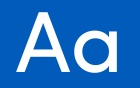
Suited for headlines, subheads, body copy and captions

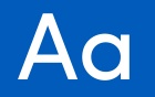
Primarily used for longer-form copy and smaller captions. More Pro can also add an air of sophistication and prestige when it’s chosen for headlines.

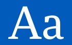
Should be used sparingly—only in headlines—to emphasize a single word.
If you require paid fonts, please contact the Office of Communications.
Acceptable Substitutes

An acceptable substitute for Sofia Pro.

An acceptable substitute for More Pro.
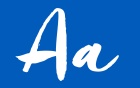
What happened to Freeland?
Freeland is a display face with a lot of personality. There’s no appropriate alternative.
Our brand has a number of graphic tools that create a unique look and make us distinct from our peers and instantly recognizable. When they’re used consistently, these elements create continuity within our family of materials, across a variety of media.